A look into the final four architecture building designs
February 26, 2013
Kent State’s College of Architecture and Environmental Design’s building design competition has come down to the final four designs. Finalists gave a presentation to the university and Kent community on Jan. 17.
Michael Bruder, executive director of Facilities Planning and Design, introduced the following guidelines that were given to the architects:
• $40 million total budget, $31 million in construction
• 122,000 square feet
• silver certification minimum
• maximizes sustainability and energy performance
• flexibility with spaces and offices
• creates non-traditional meeting places to facilitate peer-to-peer collaboration
• maximizes student, faculty and administration interaction
• provides opportunity to share and display student and faculty work
• maximize studio and teaching space
• approaches zero energy/ CO2 emissions
• integrates campus and community
Richard L. Bowen and Associates Inc. and Weiss/Manfredi
An ascending open studio loft is the heart of the building. A continuous staircase to each level connects lofts. The north side of the building has an amphitheatere-styled grand staircase joining studio critique areas allowing for student and staff interaction.
“All of the levels are interconnected and within eyeshot of each other,” said Marianne Weber, vice president of Richard L. Bowen and Associates Inc.
Transparency throughout the building allows interaction with other students, spaces, offices and classrooms.
“The idea of being able to make transparent the worlds of the library, or the worlds of a lecture space, or even the exhibition gallery along the esplanade, that those parallel worlds are not separate but in fact interconnected,” Weber said.
The 125,000 square foot building includes the features:
o The ground floor holds a public multi-space area with a library, cafe, and gallery for students and the Kent community.
o The second floor holds classrooms, labs and offices.
o The next level of the building has the design lofts.
o The building features a green roof.
Westlake Reed Leskosky
This design is a three-story building on one side, and a four-story building on the other. The inside layout of the building has a clear path from Willow Street to Lincoln Street.
“Whether I’m a student or somebody just from the community, I can actually move through the building and experience every component that the building has to offer and expose myself to what architects do” said Jonathan Kurtz, principal and lead designer of Westlake Reed Leskosky.
The building features the following:
o The first floor critique space, lighting, computer, and printing labs, an equipment repair office, a reference desk and a lockable work area.
o Level two contains a seminar room, critique space, gallery, storage area, cafe, conference and meeting rooms, faculty offices, a kitchenette and a student organizations office.
o Level three has first year and graduate studios, critique space, workspace, student commons, a computer lab, the dean and associate dean offices, a conference room, an advising office and the business and advancement office.
o The final level has the second, third and fourth-year studios.
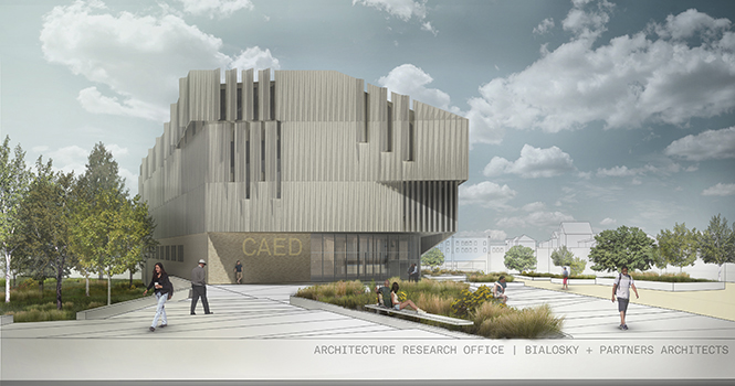
Bialosky + Partners Architects in association with Architecture Research Office of New York
Studios are the center of the building and everything collaborates to support the studio culture. Their firm uses simple, organizational triangles.
“Flexibility is really important,” said Stephen Cassell, principal and co-founder of Architecture Research Office. “If you look at an architecture school, every classroom is used from 16 to 20 hours a day. Every space has to work at least two or three different ways and be as multifunctional as possible.”
The building features the following:
o The ground floor has a gallery, classrooms, and fabrication and computer labs surrounding an all-purpose lecture hall.
o Level two has the library, administrative offices, a student commons and cafe and a great staircase to the studios.
o Level three is the studio space with showcase and critique areas as well as computer and printing labs.
o A green roof that brings natural light into the studio area tops the building.
The Collaborative Inc. of Toledo, Ohio, in association with the Miller Hull Partnership of Seattle
This design relies heavily on studio space and student and faculty interaction.
“The dean said […] we want to be in the mix. The professors want to be in the mix also,” said Robert Hull, founding partner of Miller Hull Partnership of Seattle. “That studio function, by putting them into it and having them be part of that experience, jumped up the studio portion of the program to 61 percent.”
The building features the following:
o The first floor of the building contains most public functions, along the esplanade to include the community.
o A unique “sticks of butter” design, long rectangular “studio tubes” that make the top floor.
o The “sticks of butter” are 50 feet wide and vary in length, and separate studio spaces.
o These studio spaces incorporate the faculty offices.
o The ends of the tubes have pin-up areas for everyone to use for showcasing and critiquing.
o The gaps between the “studio tubes” also allow the sun to shine through to the other side of the building and onto the esplanade.
A jury of two Kent State representatives and three award-winning architecture professionals will choose the winner in March.
Contact Anna Lemmon at [email protected].


