Rec Center Refresh
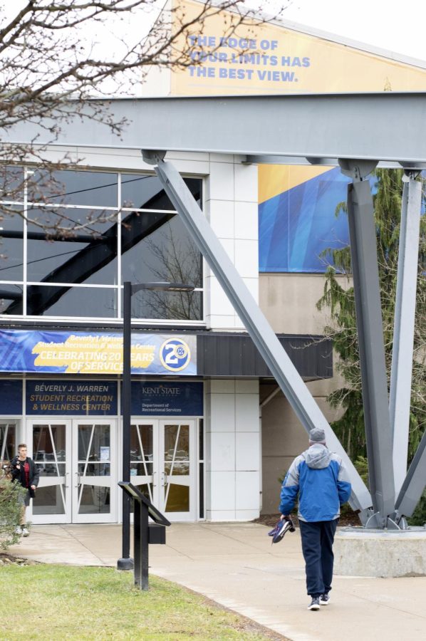
The Kent State Student Recreation and Wellness Center is located on 1550 Ted Boyd Dr, Kent, OH 44240. Sun. Jan. 26, 2020.
January 26, 2020
The Kent State Rec Center is welcoming a new blue and gold design after finishing a refresh.
“The previous color palette was green, maroon, and terracotta,” said Rufra.
Now, the Rec Center’s carpet, walls, signs, and overall design is covered in Kent State gold and blue.
Rufra said that when the Rec center first opened, the director wanted it to look high-end, which is why the color and design theme was not associated with Kent State.
James Kraus, Rec Center Marketing Coordinator, said the majority of work was painting, followed by replacing all of the carpets and updating technology in seminar rooms.
When asked about what inspired the refresh, Kraus said it was to celebrate the 20th anniversary of the Rec Center.
“I would say we are 99.9 percent done,” said Kraus.
The one thing that will continue to be slowly worked on is the natatorium, said Rufra. The area is still decorated with the previous maroon, green, and terracotta color scheme.
“We really tried to keep as much open as possible,” Kraus said.
Machines and equipment were simply moved into hallways or to other sides of the room while the carpet was being installed, so members and students could still work out,” Kraus said.
“The new blue and gold colors make more sense. It looks a lot better,” said construction management major Natalie Majc.
The Kent State colors are blue and gold, so it makes sense that the university would want the Rec Center to look cohesive with Kent State.
“The Rec Center should reflect Kent State,” said Rufra.
Hannah Burkey is a recreation and fitness reporter. Contact her at [email protected].


