

KSU receives a B- on its updated COVID-19 dashboard
March 5, 2021
The Kent State COVID-19 dashboard received a B- from We Rate Covid Dashboards after previously getting a C+ rating last October.
KSU received a C+ rating on its coronavirus dashboard in October, one of the lowest-rated university dashboards in Ohio on the We Rate Covid Dashboards website.
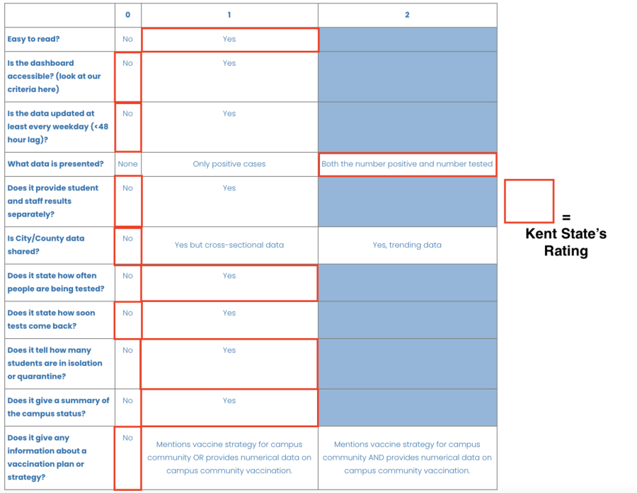
We Rate Covid Dashboards rates based on categories such as readability, accessibility, data presented and how frequently it’s updated. The main goal of the website is to hold universities to a standard to encourage them to share data well, share data truthfully and share the most possible data.
Eric Mansfield, executive director of university media relations, said edits to the dashboard happen similarly to other college, division and program pages and that as the feedback comes in they look into making improvements.
“We are always looking to improve our communications with students, so an update to the dashboard was a natural progression,” Mansfield said.
Sarah Pitafi, research assistant and project manager for Dr. Cary Gross at Yale University, is part of the team that manages and rates at We Rate Covid Dashboards. When rating KSU’s dashboard, Pitafi highlighted how it listed the exact number of quarantine rooms in use and available, as well as how the dashboard is laid out well and easy to understand.
Pitafi said that while it’s good that KSU is stating how many tests they conduct alongside the number of positive tests, it lost points for not separating the student tests from the faculty tests. “It’s generally good to have that because you want to know where the cases are coming from,” Pitafi said. “Faculty and students aren’t interacting a lot these days, so it’s good to have [different categories] to have their own number.”
KSU’s dashboard didn’t receive points for daily updating, accessibility (things like a magnify or screen reader option) and including city and county data.
“[City and county data] is really important because Kent State doesn’t live in a bubble; the rest of Ohio is there, the rest of the county is there,” Pitafi said. “It’s really interesting data to compare, the local area versus the school.”
Pitafi said KSU lost a point for not including vaccine information, but that’s common across university dashboards.
“A lot of schools don’t have that yet, but it’s good for them to start considering it and putting it into motion,” Pitafi said. “Especially now that it’s March and we’re kind of hurtling towards a vaccination period. It would be good for schools to say, ‘Hey, this is going to be our strategy’ at the very least, if not including numbers of who’s vaccinated.”
Mansfield said the numbers on KSU’s dashboard are updated weekly, and extra information about testing, quarantine, vaccination and the Flashes Safe Eight can be found on different pages on KSU’s website.
Ethan Cohen is a COVID-19 reporter. Contact him at [email protected].